Impact
Successfully designed and delivered the new Trinity Design System to product teams. The Trinity Design System was quickly adopted by designers which helped to improve consistency and improved design to development times.
Overview
Problem
Bill, had just completed a successful brand update and product redesign. The new experience was released to users. but the platform design team was not using a Design System for scaling product design. This was generally slowing down teams from scaling their work.
Task
Create a set of Product Design tools for Design teams to use to build product service experiences at scale. Base the Design System on a recently redesigned, and coded product experience.
Stakeholders
Design
Engineering
Product Platform
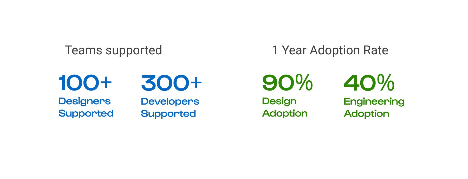
Team
Product Designer
Web Technologist
4+ developers
~ 6 Months time frame
My role
Run the process for designing the Design System of an in flight product. Document the system, build design tools for teams.
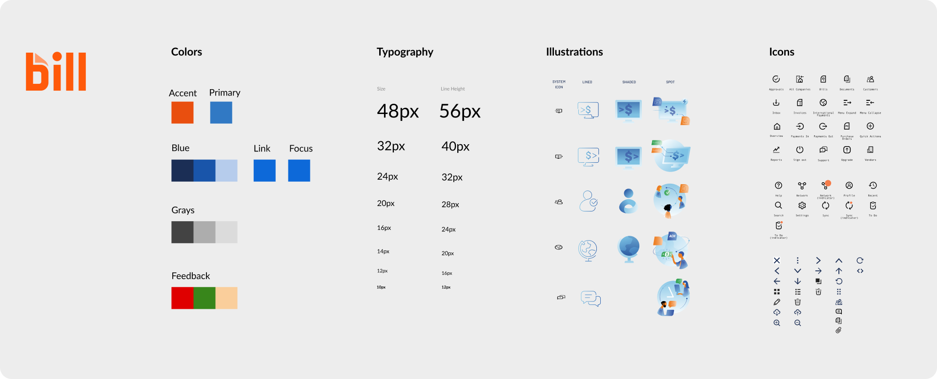
Define the visual design language.
Design & validate components.
Build tools for Designers in Figma.
Ensure design to code fidelity.
Support teams using the system.
Process
My team agreed to follow a 5 step process for designing parts of the system. This process scales well to large or small projects and gave us a consistent end-to-end framework to follow throughout.

Discover
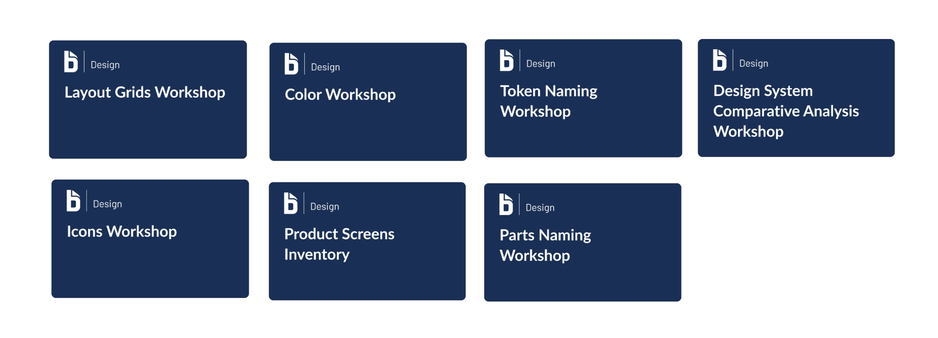
Discovery Workshops
Ran various discovery workshops to help get teams aligned.
Design System Comparative Analysis
Gave team sense of what large corporate Design Systems are doing. Helped to us to get on same page with our stakeholders, speaking the same language. Help to identify core Design System components, table stakes.

Brand inventory
Collected and categorized brand elements to inform the creation of foundations and asset libraries. This helped us ensure alignment with the brand team on the Bill visual aesthetic.
Bill product audit workshop
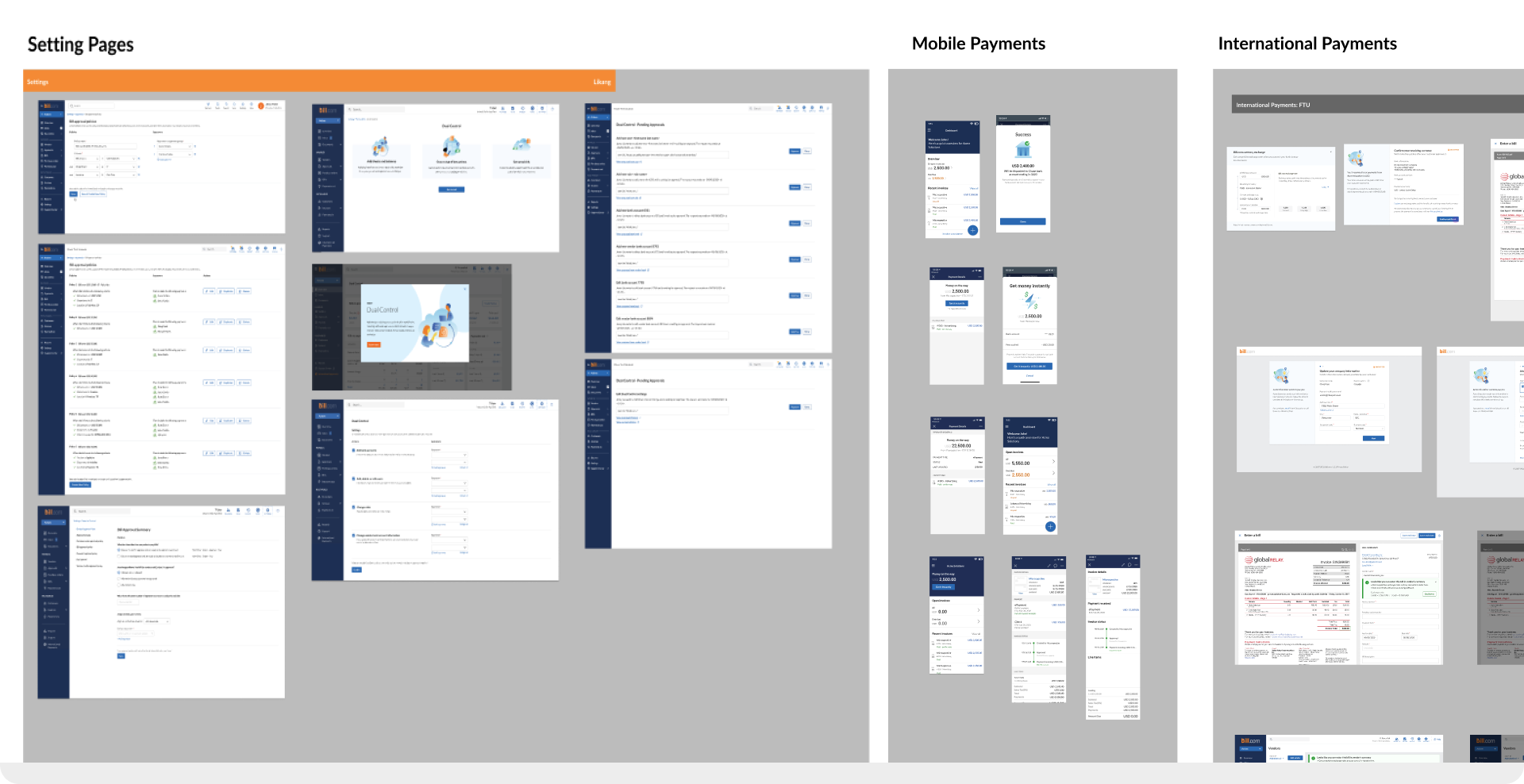
Ran product audit workshop with designers. This helped teams spot variances in page types, IA, and layout. Gave us a opportunity to share the inconsistencies as a team. Allowed to get insight into how designers are thinking of the system. Helped drive decisions on on designing page templates.
Parts naming workshop
Worked with designers and developers to identify the system elements using a parts naming workshop. Allowed us to establish a shared understanding of component as a team. Helped establish which components are most common across domains and allowed us to see the inconsistencies in the design.

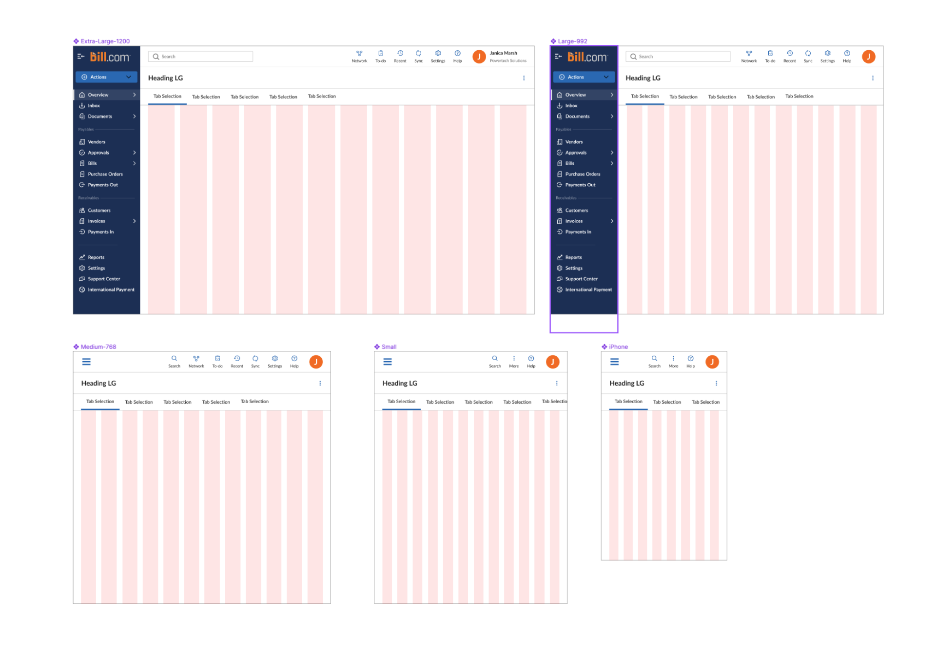
Layout grid audit
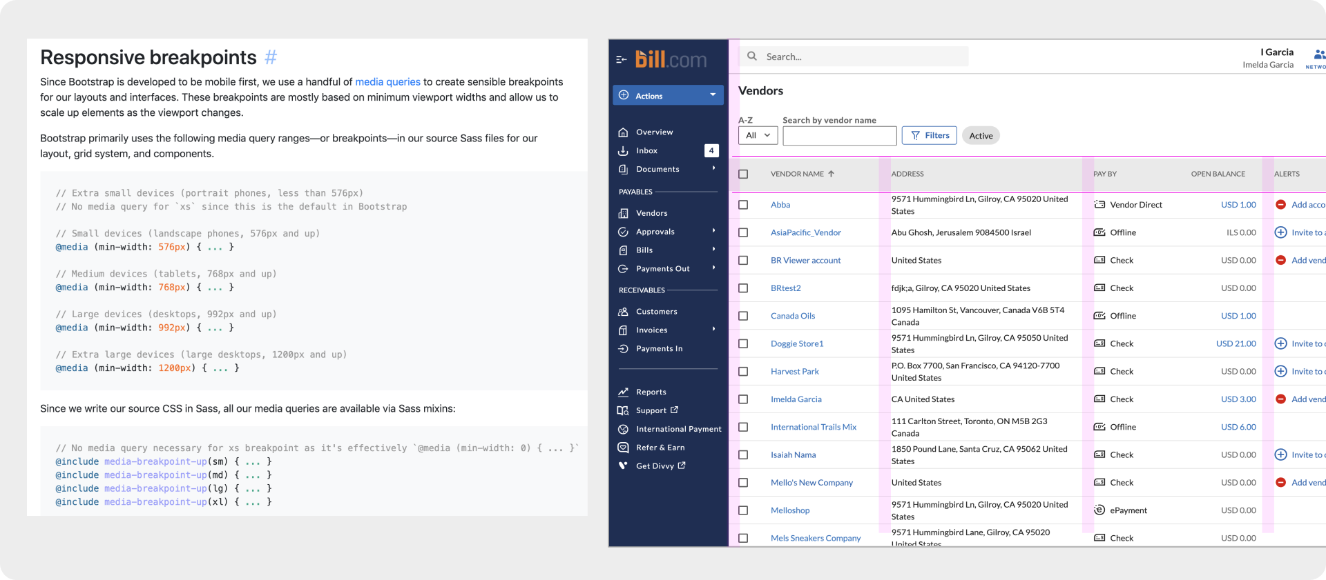
Revealed current layout structure in our designs, and how pages are built. Helped to establish a baseline for visual layout to guide decisions on spacing and page layouts. We need to create a grid system that could be adopted by teams, the audit helped inform the decisions on grid layout and breakpoints we needed to design and document.
Design
Design workshops
Ran multiple design workshops for foundations, components and patterns, collectively categorizing existing design, and establishing basic requirements for things in the system.
Component and pattern design workshops
Foundations and tokens design workshop
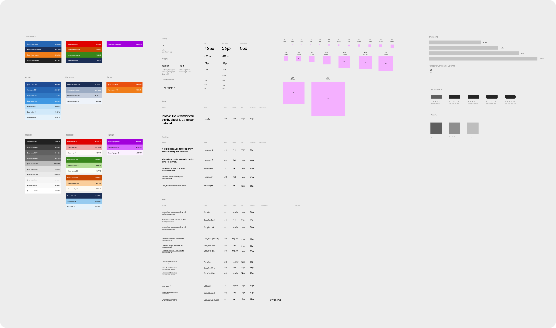
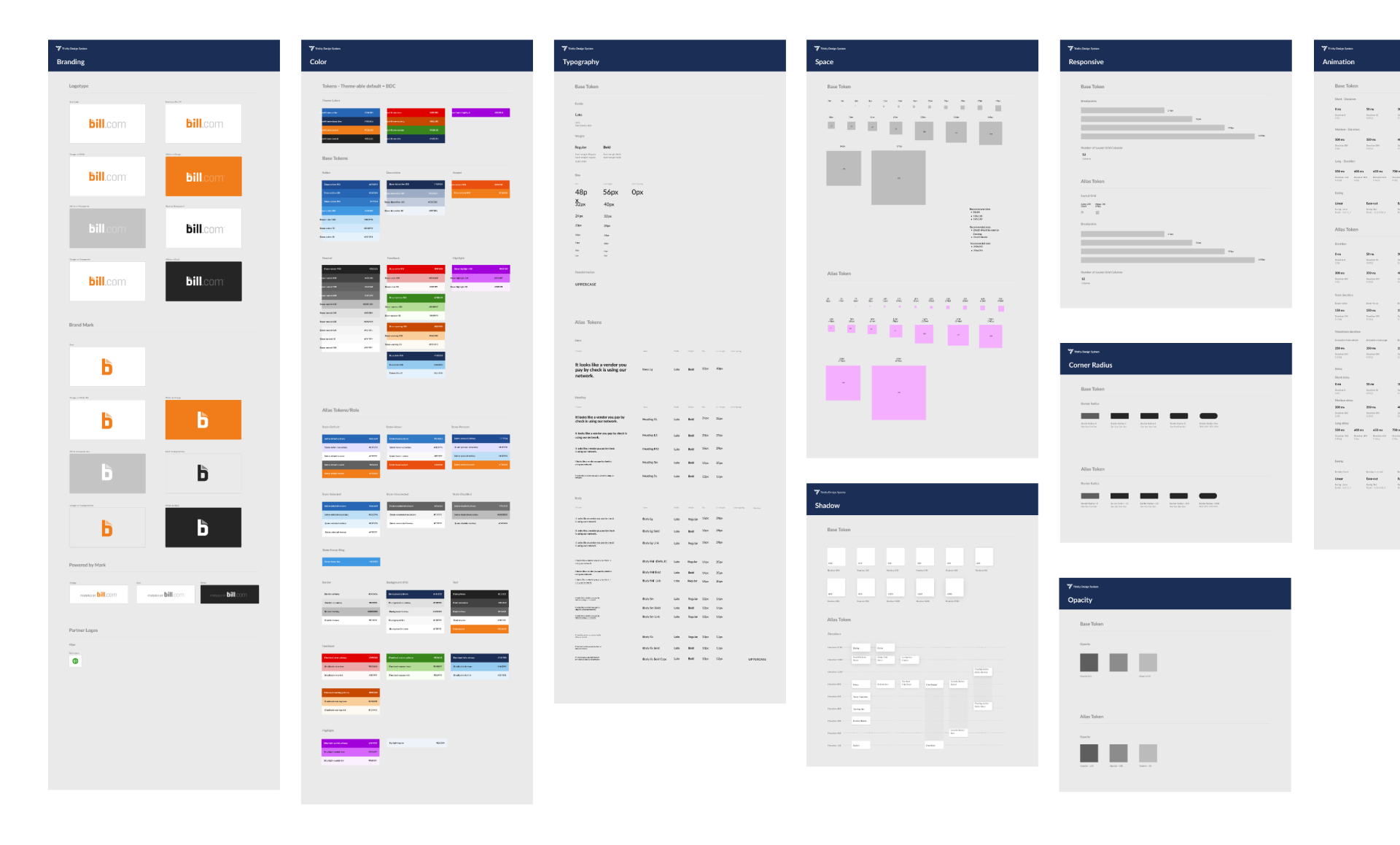
Provided Design solutions for visual design language in a format that can be shared easily and made available in Figma as styles. This also matched the values of the tokens being used in code.
Designing all of the parts
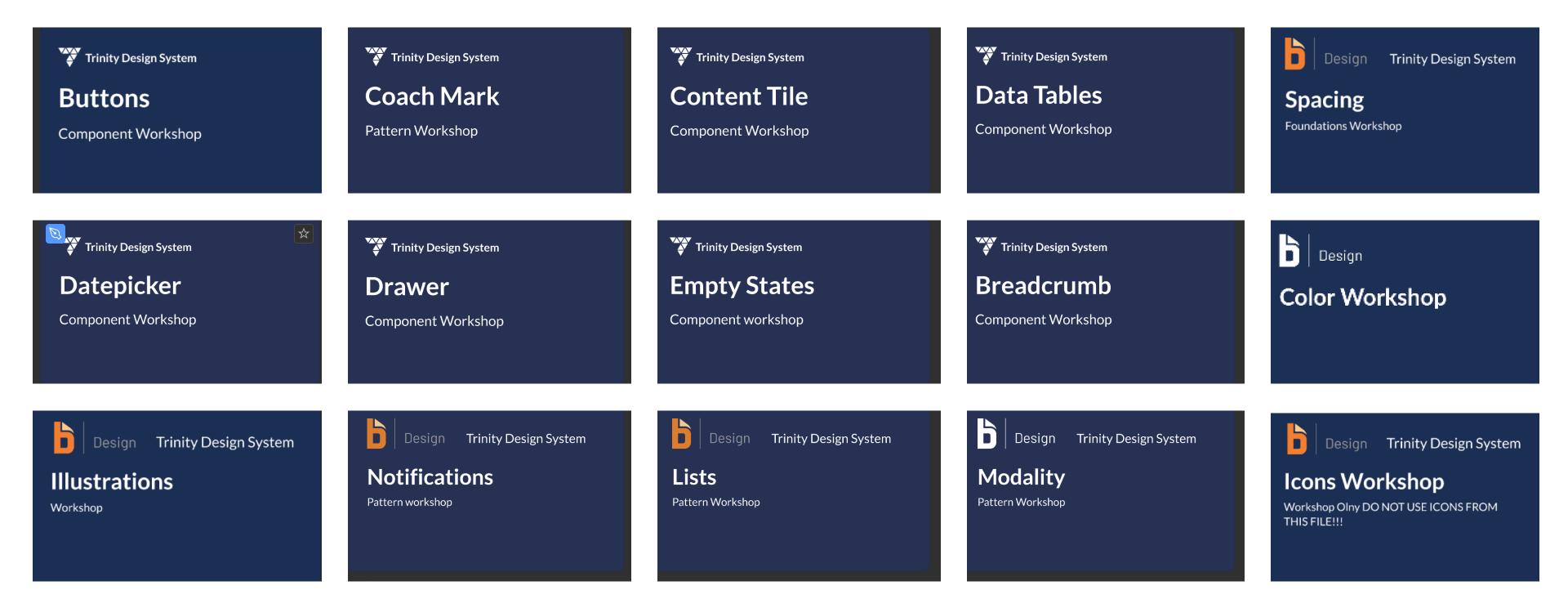
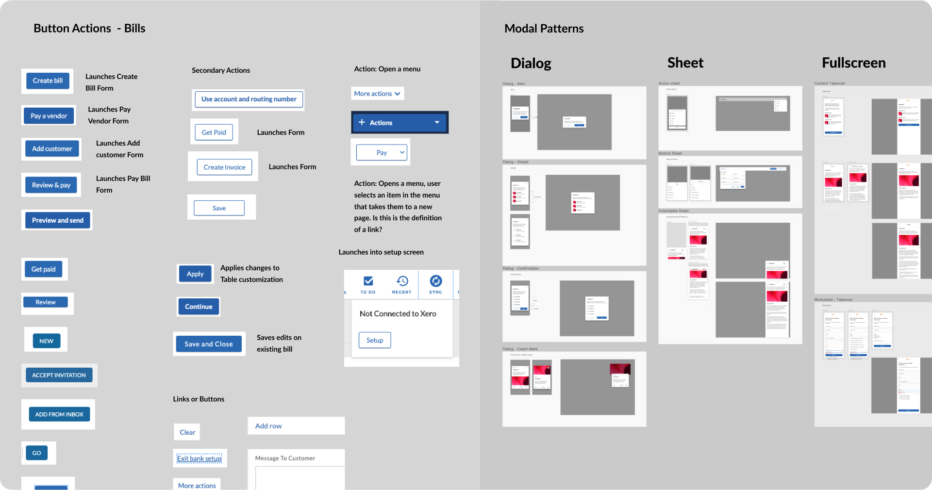
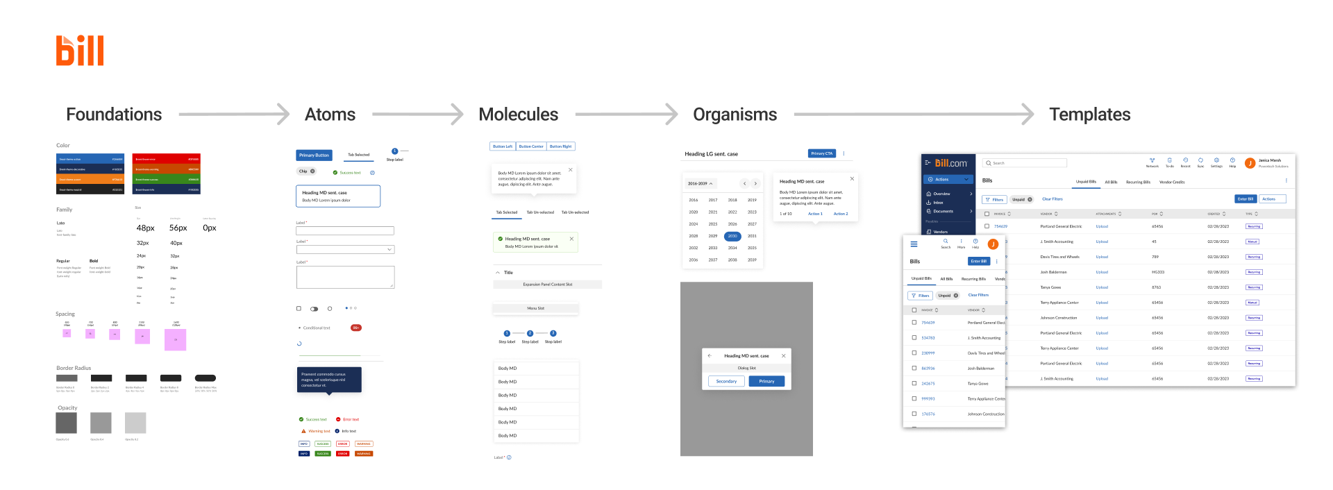
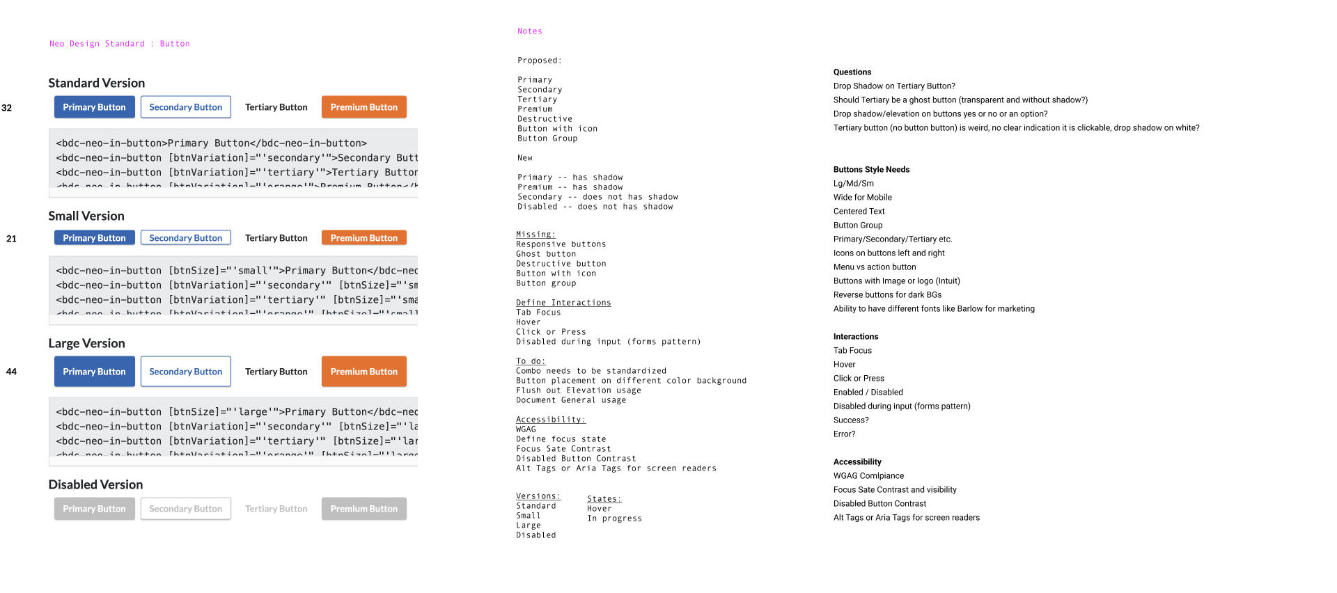
Designed multitudes of components for designers to use based on atomic design principles.
Build
Figma design libraries
Provided self service design tools that helped align design teams. Gave us the start of a scaleable system.
Foundations and tokens libraries
Gave designers a visual language library to use for content design. Connected the tokens to the parts of the system.
Component libraries
Gave designers shared libraries of components. Developers know they can trust the design as it is aligned with code.
Page templates
Helped to jumpstart projects. Gave designers a sense of responsive breakpoints.
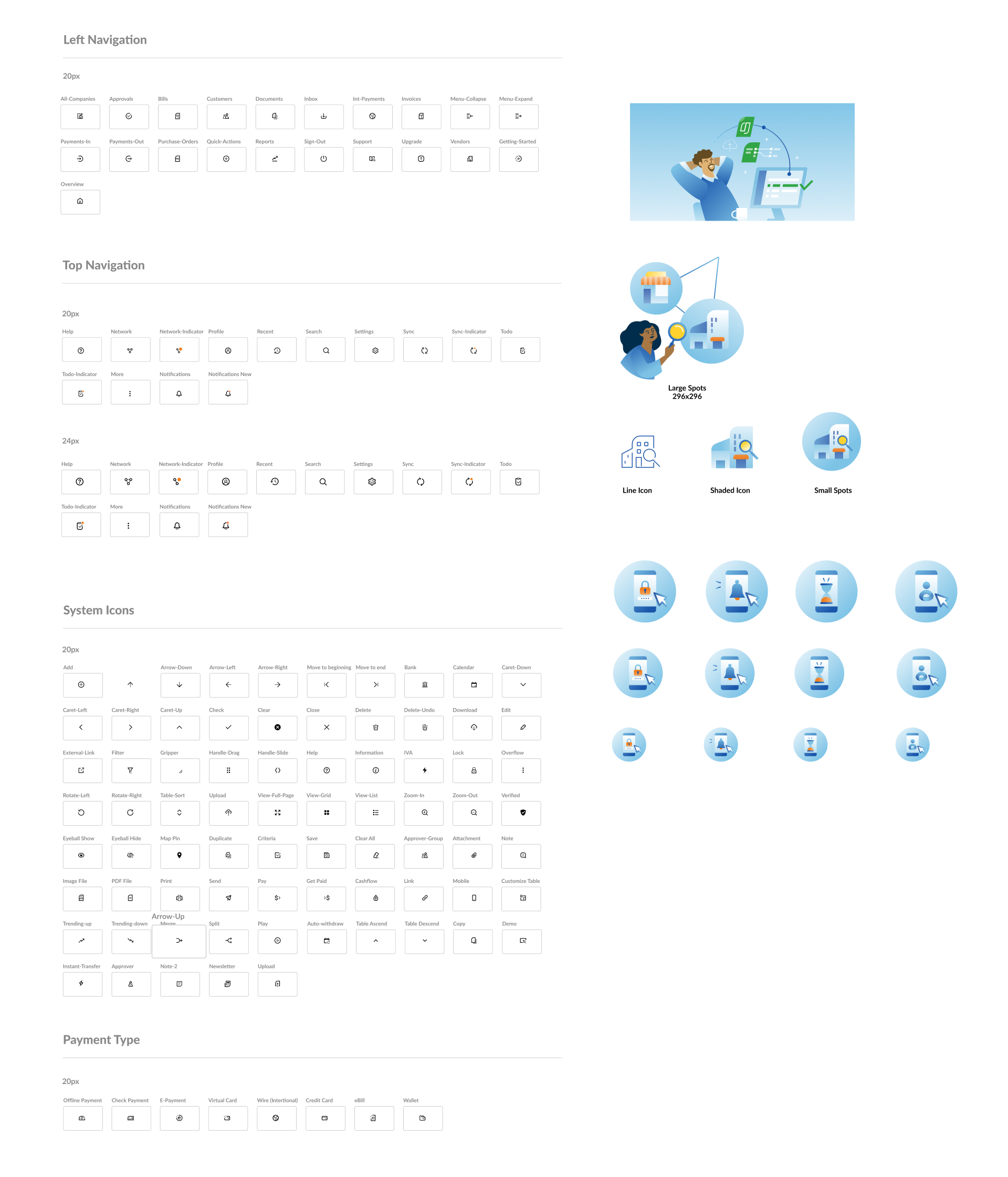
Icon and illustration libraries
Ensured that brand assets are available to designers. Icons and illustrations libraies are built into components, but can also be used independently in content design.
Document
Our team wrote and published various types of documentation to help guide the build and usage of the Design System.
API documentation for components
Collaborated with DS team developers on API language for each component. Ensured alignment on how we describe component properties and options. Focus was put on using terminology that designers could understand.
User Documentation in ZeroHeight
Wrote comprehensive documentation for the system. Shared company wide it created a SSOT for product teams.

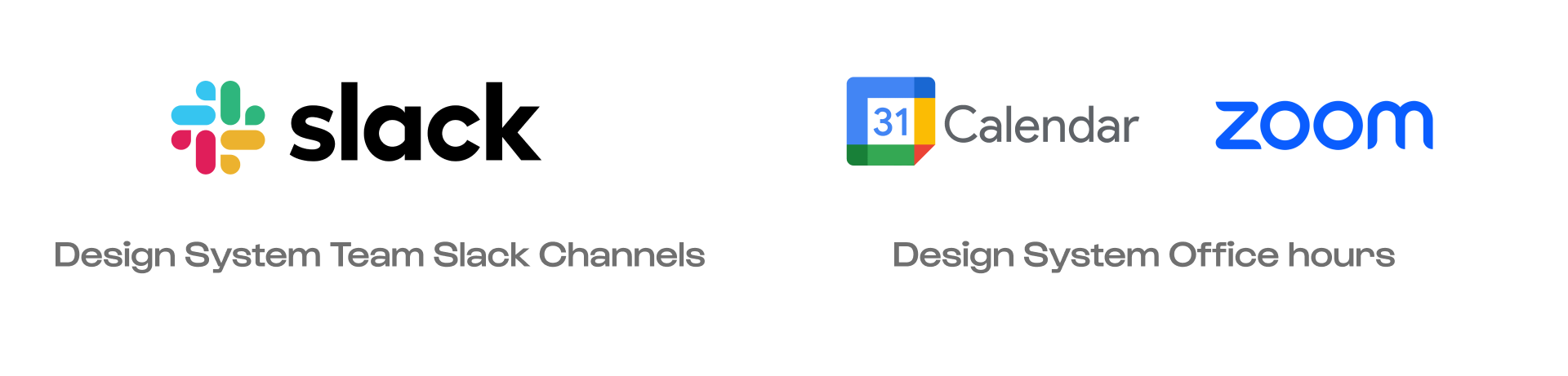
Support
Helping our customers to use the tools
Created and staffed multiple support channels in Slack.
Managed backlogs of issues and requests.
Gave users clear solutions to problems in the moment if possible in office hours.
Enabled async work streams on workshops via slack.
Built trust with partner teams being available to help them.